Microtypography and font expansion
Categories: speedata Publisher
The speedata Publisher is built on top of LuaTeX, a typesetting software with a strong focus on typography. Therefore it inherits all the possibilities offered by the layout engine. One of the older features is the ability to stretch or shrink glyph widths on demand to allow even better line breaking.
TeX already uses the famous line breaking algorithm that optimizes the appearance of a full paragraph as a whole, not a line-by-line approach that might lead to large inter-word spacing.
The ability to stretch or shrink glyphs by a little amount can lead to many more possible line breaks and thus enhancing the overall visual outcome of a paragraph. The famous Gutenberg 42 line bible (B42) has a similar approach to line breaking.
The speedata Publisher by default uses a little percentage to stretch or shrink glyphs. This helps text in narrow columns to be typeset nicely.
The speedata Publisher
As mentioned above, the speedata Publisher turns on font expansion by default. The option fontexpansion is used to control this behavior:
<Options fontexpansion="yes" />
The allowed settings are:
noAll characters retain the width specified by the font designer.
someThe line break is carried out with the original widths, after the break the characters can be changed slightly in width so that the spaces between the words are slightly reduced.
yes(default setting) The paragraph break is tried out with different character widths and then the best result is used.
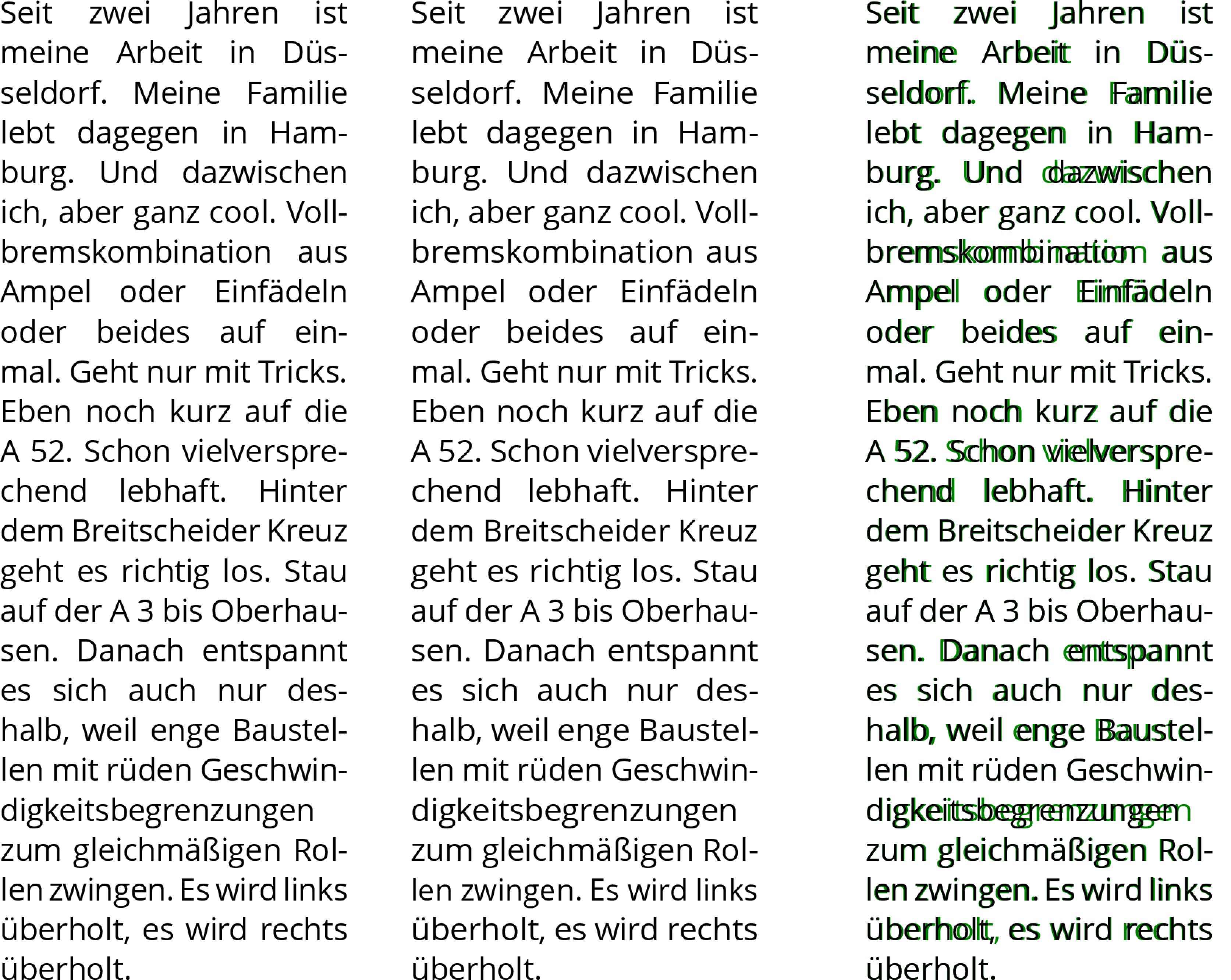
To see the effect of some, here is a German text that is typeset with none (left) and some (middle) and a comparison of both (right), where the green text is identical to the middle example. German texts are known to have long words…

Text typeset with font expansion off (left), some (middle) and a comparison (right)
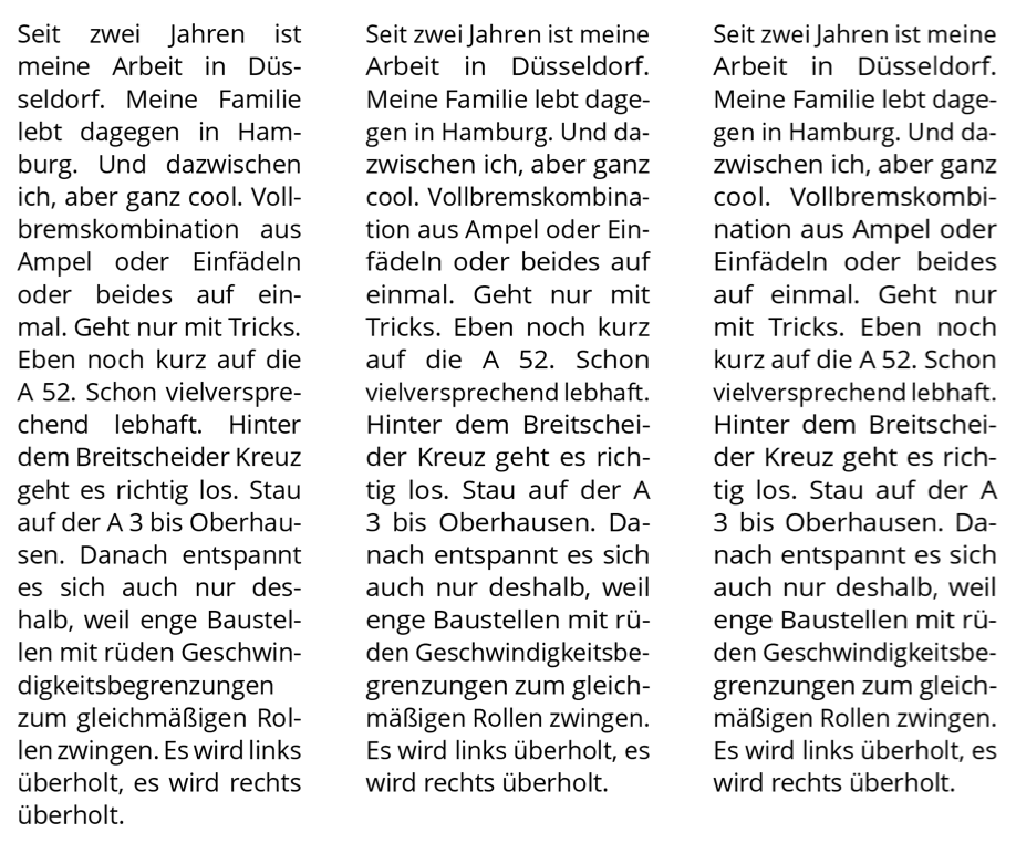
The result of yes is more drastic. Many more possible line breaks can be considered if words can be squeezed a little to fit in to a line or stretched so the inter word spacing would be a little smaller. See the following figure. With fontexpansion="yes" you have to experiment a little to determine a good degree of stretching and compression so that the paragraphs also look “good”. On the left, fontexpansion is set to no, for the other two to yes. The paragraph on the right is set with the values 5% stretch and 3% compress (50 and 30 for fontstretch and fontshrink).

Text typeset with font expansion no (left) and yes (middle and right). The text to the right has higher values for stretching and shrinking.
You can influence the values either on a font basis or via the global <Options> command.
fontstretchSpecifies the percentage by which the characters may be stretched. Specification is in 0.1 per cent: a value of 20 means 2%. The default setting is 40 (= 4%).
fontshrinkLike
fontstretch, only as an indication of the compression. The default setting is 30 (= 3%).fontstepThe steps in which the wrapping algorithm "tries out" the stretching or compression. The default setting is 10.
These settings are also available for <LoadFontfile> (without the font prefix), but beware that the settings must be the same for all fonts in a paragraph.

