

A page looks innocent: the algorithms behind a typeset page
Categories: Development
When you look at a page of a well-typeset book or catalog, you usually don’t notice anything special. There is some text, maybe a table, a picture or a footnote. But every line on such a page is the result of many small decisions. The algorithms behind them were invented decades ago, and people still work on them today.
In this post I want to show what happens on a page. I start with the whole page and then go down step by step, until we are at the bytes in the PDF file. On each level I show how the speedata Publisher does it (it uses LuaTeX in the background) and how boxes and glue does it. boxes and glue is the Go library I am writing as a foundation for the future. Both are open source, you find them on GitHub: speedata/publisher and boxesandglue.
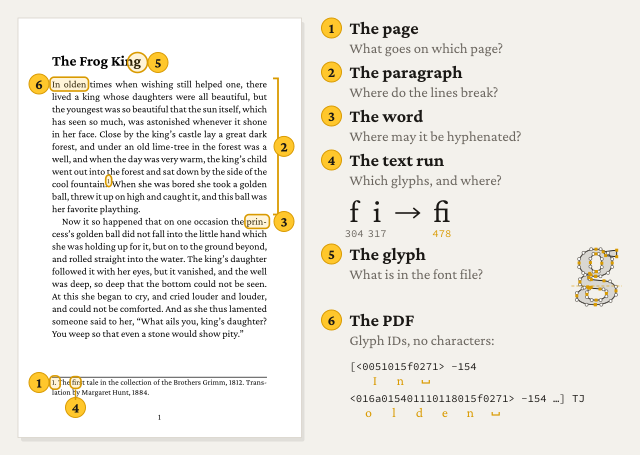
A page typeset with boxes and glue. The numbers are the sections of this post.
Two engines, one set of problems
First a few words about the two engines.
The speedata Publisher lets LuaTeX do most of the typographic work. The Publisher decides where things go on the page, LuaTeX decides how a paragraph is broken into lines, and it writes the PDF. The Publisher uses Lua callbacks to hook into LuaTeX. This works well, and because of this the Publisher had very good typography from the start. But LuaTeX is one big program. If one part does not do what you need, you have to find a way around it.
boxes and glue does the same work in separate Go modules. Each level in this post is its own package, and you can use it, test it or replace it on its own:
| Level | Question | speedata Publisher | boxes and glue |
|---|---|---|---|
| Page | What goes on which page? | Publisher (Lua), on top of LuaTeX boxes | htmlbag, xts |
| Paragraph | Where do the lines break? | LuaTeX line breaker | boxesandglue |
| Word | Where may a word be hyphenated? | LuaTeX patterns | hyphenation |
| Text run | Which glyphs, in which positions? | HarfBuzz, compiled into LuaTeX | textshape (HarfBuzz ported to Go) |
| Glyph | What is in the font file? | HarfBuzz, compiled into LuaTeX | textshape |
| How is it written down? | LuaTeX backend | baseline-pdf |
Most of the algorithms are the same in both systems. The difference is the architecture, and this is more important than it looks at first.
1. The page
The first and largest question: what goes on which page?
TeX has a page builder. It collects lines until the page is full and then calls the output routine. This is a piece of code that gets the material and decides what to do with it. It is very powerful, but also very hard to use. The speedata Publisher never used it. It has its own page model with a grid, areas and explicit positions.
Some problems on this level:
- Widows and orphans: a single line of a paragraph alone at the top or bottom of a page looks wrong. To avoid it, lines have to move to the next page, and then there is a gap on the current page.
- Tables across pages: if a table does not fit, it is split between two rows. The header is repeated on the next page, and perhaps there is a footer like “continued on next page”. The split should not leave a single row alone.
- Floats: an image should be near the text that refers to it, but not necessarily at the exact place.
Footnotes
Footnotes look like the easiest thing on a page, but they are among the hardest. A footnote must be on the same page as its reference. But the footnote takes space from the main text, so maybe the line with the reference does not fit on the page anymore. Then the reference moves to the next page, and the footnote has to move with it. A long footnote sometimes has to be split across two pages, while the reference stays on the first one.
TeX solves this with insertions. This is a separate mechanism next to the page builder that keeps track of the space the inserted material needs.
In boxes and glue, footnotes are done in htmlbag, the HTML layer. There, the footnote is tied to the line with its number. If the line and the footnote don’t fit on the page together, both move to the next page. Splitting a long footnote across two pages is not possible yet.
2. The paragraph
Now let’s look at one paragraph. Where should the lines break?
The simple way is to fill a line until the next word does not fit, and then start a new line. Word processors do it like this. The result is that some lines are tight and others have big gaps between the words.
In 1981 Donald Knuth and Michael Plass published a different method. It does not look at one line at a time, but at the whole paragraph. Each possible break point gets a cost: the badness of the line that ends there, plus penalties for hyphens and for hyphens in consecutive lines. Then the algorithm searches for the break points with the lowest total cost, the demerits. So a decision in the first line can depend on the last line.
Knuth and Plass describe this as a graph. Each feasible break is a node, and each possible line between two breaks is an edge. The edge has the demerits of this line as its weight. The best paragraph is the cheapest path from the start to the end. Here is the graph for the first sentence of “The Frog King”, the fairy tale that is also used in their paper. boxes and glue computed the numbers:
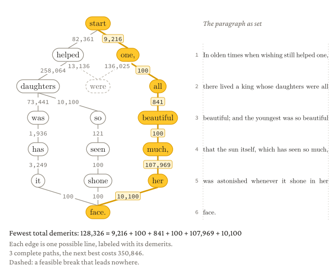
Feasible breaks for a 190 pt column in Latin Modern 10 pt. The cheapest path has a loose fifth line (107,969 demerits), because all other paths start with worse lines.
You can try it yourself. Change the width of the column and see how the line breaks move. Sometimes a line far away from the end changes:
The full version of the demo shows more of what the algorithm sees: for each line the adjustment ratio (how much the spaces are stretched or shrunk), the badness and the demerits. You can also change all the parameters that TeX uses for the decision.
Two more things make the result even better:
- Font expansion: the glyphs can be made a little bit wider or narrower, so the line breaker has more freedom. I wrote about this in Microtypography and font expansion.
- Hanging punctuation: hyphens and quotes at the end of a line stick out into the margin a bit, so the edge looks straight to the eye.
3. The word
Now we go to a single word at the end of a line. Can it be hyphenated, and where?
A dictionary with all hyphenations would be huge. TeX uses patterns instead. This idea is from Frank Liang (1983). A pattern is a small part of a word with numbers between the letters. Odd numbers allow a break, even numbers forbid it, and the highest number wins. A few thousand patterns per language are enough for almost every word, even for words that did not exist when the patterns were made.
Here is an example: the word hyphenation with the US English patterns. Nine patterns match some part of the word. Each one puts its numbers into the gaps between the letters, and for each gap the highest number counts:
   .   h   y   p   h   e   n   a   t   i   o   n   .
     0   0   3   0   0   |   |   |   |   |   |   |    hy3ph
     |   |   |   0   0   2   0   |   |   |   |   |    he2n
     |   |   |   0   0   0   0   4   |   |   |   |    hena4
     |   |   |   0   0   0   5   0   0   |   |   |    hen5at
     |   |   |   |   |   1   0   0   |   |   |   |    1na
     |   |   |   |   |   0   2   0   0   |   |   |    n2at
     |   |   |   |   |   |   |   1   0   0   0   |    1tio
     |   |   |   |   |   |   |   |   2   0   0   |    2io
     |   |   |   |   |   |   |   |   |   0   2   0    o2n
max: 0   0   3   0   0   2   5   4   2   0   2   0
final: h   y - p   h   e   n - a   t   i   o   n
Only two gaps have an odd number, so the word can be broken as hy-phen-ation. The gap between “a” and “t” is interesting: 1tio would allow a break before “tion”, but hena4 has a higher, even number at the same place and so forbids the break. The patterns are careful on purpose. They miss some correct hyphens, but they almost never allow a wrong one.
boxes and glue uses the same pattern files as TeX. The table above is the debug output of hyphenation, the Go port of the TeX algorithm that boxes and glue uses.
4. The text run
Now we are inside a line. The text is a sequence of Unicode characters. But a PDF does not contain characters, it contains glyphs, the shapes from the font. The step from characters to glyphs is called shaping, and it is much more than a simple table lookup:
- Ligatures: “f” followed by “i” can become one glyph “fi”.
- Kerning: the pair “AV” is moved closer together than “AH”.
- Contextual forms: in Arabic a letter has a different shape at the start, in the middle and at the end of a word.
- Reordering: in Devanagari a vowel sign can be written before the consonant, although it comes after it in the text.
- Direction: Hebrew and Arabic run from right to left, but numbers inside them from left to right (the bidi algorithm).
All these rules are in the font itself, in the OpenType tables GSUB (substitution) and GPOS (positioning). The program that reads these tables and applies them is the shaper. The reference is HarfBuzz. It is used by browsers, LibreOffice and nowadays also by LuaTeX, and so by the speedata Publisher. boxes and glue uses a Go port of HarfBuzz, so everything stays in Go.
Here you can watch a shaper at work. The demo runs HarfBuzz in your browser and draws each glyph from its outline in the font. So you see exactly what the shaper decided. With the slider you go through the shaping step by step: first the Unicode characters, then the glyph IDs from the cmap table, then each lookup that changed something. Look how “f”, “f” and “i” become one glyph, and how “A” and “V” move closer together. You can switch features on and off, or drop your own font on the box, for example an Arabic one.
More features of this font (0)
And here the same for Arabic. In the step with cmap, every letter still has its isolated form. Then the features init, medi and fina give each letter the form for its position in the word, and the letters connect:
More features of this font (0)
5. The glyph
One step further down: the font file. An OpenType font is like a small database. The cmap table maps characters to glyph IDs, hmtx has the widths, glyf or CFF has the outlines, and GSUB/GPOS have the rules from the last section. Variable fonts add axes like weight and width, and color fonts have their own tables for emoji.
And what about hinting? On a screen, each glyph is drawn with pixels. If there are many pixels per em, the shape is fine. If there are only a few, the shape breaks: one stem gets one pixel, the next one gets two, and a bowl is closed.
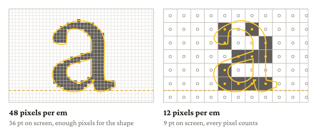
The a of Crimson Pro. A pixel is black when its center is inside the outline. At 12 pixels per em and without hints, the letter breaks apart.
Try it yourself. Move the slider and see when the letter breaks. You can also type other letters. For example, at 13 pixels per em the “m” loses its middle stem completely. Or switch on anti-aliasing. Then a pixel gets a gray level for the part the outline covers. This is the other answer to the pixel problem, and it is the reason why macOS mostly ignores hints.
Hints are instructions in the font. They tell the rasterizer how to move the outline to the pixel grid at small sizes, so that all stems have the same width and the x-height is on a full pixel. The typesetting engine does not use them. It calculates everything in the design units of the font, and these do not depend on any device. When you look at the PDF on a screen, the PDF viewer can use the hints. On paper they don’t matter at all. So this is the one level in this post that the typesetter does not have to care about.
6. The PDF
Now we are at the bottom. What does a line of text look like inside the PDF?
Here is the start of the first line of the sample page from the beginning. It is taken from the PDF, only decompressed and shortened where you see “…”:
BT
/F2 10 Tf
1 0 0 1 34.02 350.2 Tm
[<0051015f0271> -154 <016a015401110118015f0271> -154
 <01a4013d015d011801980271> -154 ... <01a4013801180190> 21 <01180271> ...] TJ
ET
BT and ET start and end a text object. /F2 10 Tf selects the font F2 (Crimson Pro) at 10 pt, and Tm puts the start of the line 34.02 pt from the left and 350.2 pt from the bottom of the page. Then TJ draws the line. The text in the angle brackets is not “In olden times”, it is glyph IDs with four hex digits each: 0051 is the “I”, 015f the “n” and 0271 the space. The numbers between the strings move the next glyph, in thousandths of the font size. -154 moves it 1.54 pt to the right. This is the extra space from the justification of the line. The 21 inside “there” moves the last “e” 0.21 pt to the left, closer to the “r”. This is kerning from the font.
The font is embedded, but only the glyphs that are used (a subset). The text is written as glyph IDs, not as characters. This is why copying text from some PDFs gives you garbage: without a ToUnicode table there is no way back from the glyph to the character. Ligatures make it even harder: the single glyph “fi” has to be mapped back to two characters.
For accessible PDF (PDF/UA) every piece of text also needs a tag with its role in the document: heading, paragraph, table cell, footnote. How you can check the result is described in Checking PDF/UA without firing up a Windows VM.
If you want to see this level in more detail: in my series “What is PDF?” I write a PDF file by hand. Part 2 is about text and the TJ operator with kerning, part 6 about tagged PDF.
Zooming out again
So back to the page from the beginning. There are six levels, from the page down to the bytes, and each has its own algorithms. Some of them are older than the PDF format. The reader does not see any of this, and this is how it should be.
But the levels are not really separate. A ligature from the shaper changes where a word can be hyphenated. A color change in the middle of a line can remove a space from the text in the PDF. In my experience the most interesting bugs are at the borders between the levels. This is one reason why boxes and glue has each level in its own package: if something goes wrong, you can look at one level at a time.
Each of these levels could have its own post. Which one would you like to read first? Contact me on mastodon (speedata@typo.social)